It would seem that the end user has no idea what “cut” means. I never have to “go back to the original directory to delete the originals”. That is what “cut” is for.
Besides, as other comments pointed out, one can make a multiple selection, and then, in conjunction with “cut”, it will work exactly like the feature described at the end. 🤷♂️
I think what the user is trying to say: I’m moving a large number of files to different locations. So selecting a large number of files and copy pasting isn’t really helpful. I can imagine navigating to a folder, selecting the right file, copy, navigate to the other folder, paste etc. to be very inefficient. I can imagine in such a case a copy to / move to feature is useful and I have seen that feature in a lot of other places.
Of course the user would be helped somewhat if he understood what cut meant and the other commenter isn’t really helpful in this aspect. Just saying: “There is cut” doesn’t help if the user doesn’t understand what cut means.
Also calling a user out like this is really uncool, the user obviously doesn’t have English as a first language and/or has trouble expressing their selves. This doesn’t invalidate them or their request.
Totally agree.
Ok, folks, one of us needs to do a PR on this app to implement this fella’s feature request!
I’ll add it my list of things I want to do but never get round too.
I have thought about that too, but I’m pretty sure the user has difficulties even before that, like they are copying one by one and then deleting from the old place.
But considering the shrug face at the end, and I also think there’s something wrong with this bug report, I have a feeling that this is not even a honest issue.
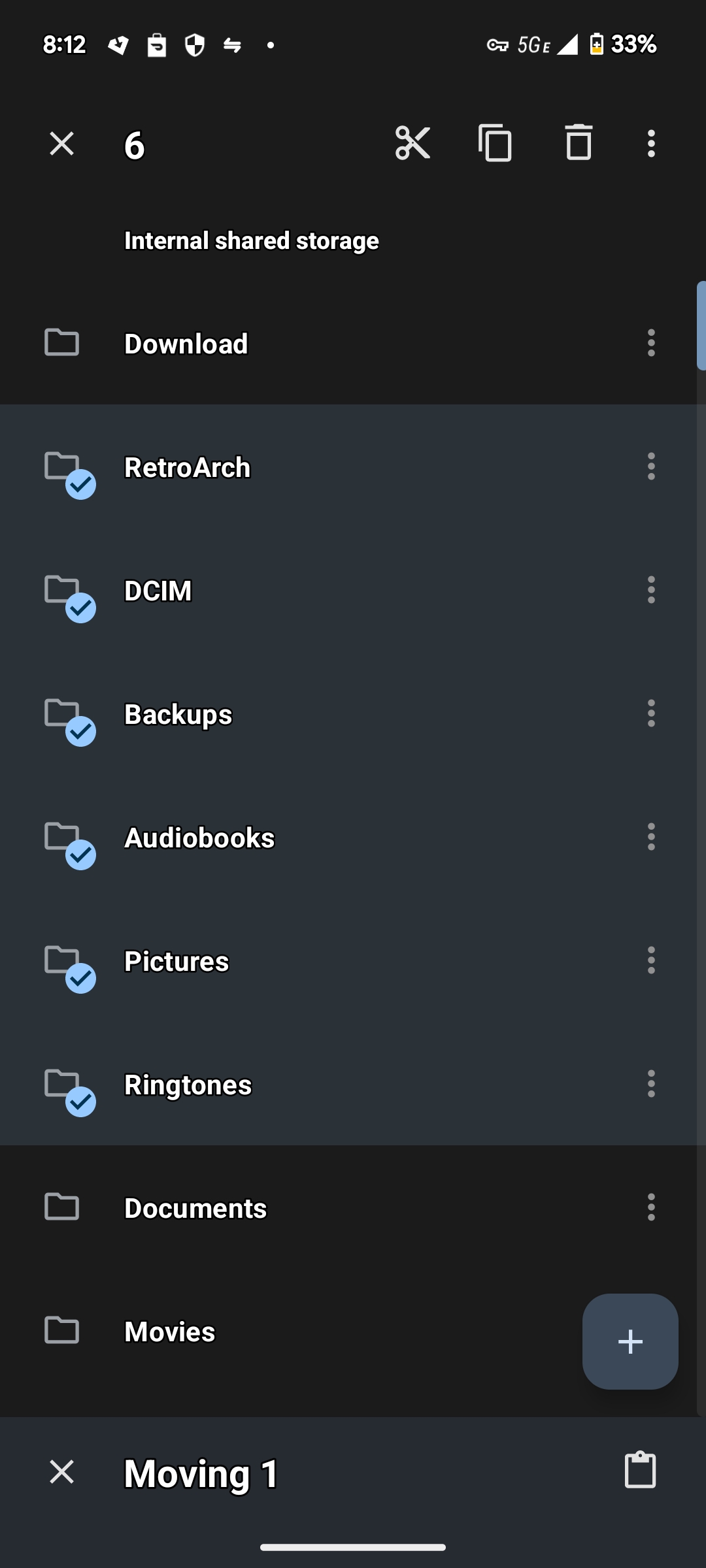
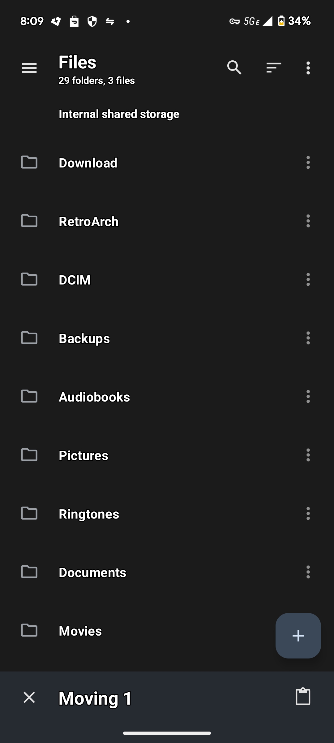
I use material files and when you press the cut icon, it literally says “move to” while you are selecting the destination
That’s not what they are requesting.
They are requesting a context menu option, no? And the ability to move multiple items?


The context menu would literally say “Move To”/“Copy To” and open either a further drop-down with potential destinations:

 … or a pop-over dialogue something like this:

Originally Windows pointed this feature to users’ Downloads, Pictures, and Documents Folders, but as you can infer from the screenshots, the menu was configurable.
I do not need and probably wouldn’t impliment this feature in a mobile file manager app, but I would be telling the OP I just don’t want to do it because its my app with my aesthetic/sensibilities in mind, NOT gaslighting/trolling them that its already implimented.
Well i don’t think they are trolling i imagine they legitamately don’t realize that is what the poster is wanting. It’s not very clear
That’s my initial impression as well, but it also seems that they just don’t care, and will refuse to until its made clear to them just what a bad look this is, and nothing short of an accusation of impropriety has done the trick yet.
I doubt english is their first language, but more importantly, it seems like there’s a culture disconnect versus mainstream western pr bullshit … which actually serves a useful purpose for once, in this instance.
This is barely related, but I’ve recently discovered it using Firefox and just wanted to share my misery. If you’re not using Chrome with the Google Docs extension, then Google Sheets will REFUSE to let you copy and paste with a right click context menu. But you can just press the keyboard keys to do so, or use the menu options to do so.
Like…what? It works, but they refuse to let you do it with the context menu, despite including them in the context menu.
If you try, it pops up a window and tells you that you have to install their extension or pound sand.
Yeah, well, I would advise you against using google docs, but at least you are using Firefox 😅
Tbh I am not surprised there are people who don’t know what cut is. When I was in school a lot of people around me though it was just the graphical button to delete things. I think UI tried to solve the problem since them : cutting won’t delete a file but will just shade it, which makes it more obvious that you should do another action.
Why would you censor a name if you leave the rest of the identifying information there?
No reason to name an person just to make fun of what they wrote. Why would you go out of your way to find the original issue?
It’s really not out of the way though
Not out of the way but they are the ones who searched for it and posted it here
Much easier to scroll through a HTML layout formatted to my phones font than clicking on several images in sequence
Was about to say the same thing. You can just do a quick search and find it all.
That’s true for any conversation that isn’t a DM, though. All popular search engines let you enter a string in quotes and find pages that matches exactly. But if someone wanted to make fun of me on the internet, I would prefer if they censored my name.
Which side of the conversation are we mocking here? Guessing the user is unaware they can select multiple files at a time … but I’ve also found the menu options they are asking for useful in the past.
There is also the factor that the user appears unaware that the feature he is requesting is already present, because you can just cut/paste.
No, they are requesting a drop-down menu option, or menu-bar option(not familiar with this software, but normally such options would go under the Edit menu), one that either opens a further drop-down with likely destinations(a built-in feature in Windows file manager of all places, some twenty years ago) or a whole pop-up dialog. If anything, they could stand to be more specific with their request, as they undoubtedly have a preference.
Don’t confuse UI requests with underlying functionality and technical capabilities. Tell them their UI request won’t be implimented for whatever(keeping things uncluttered maybe?) reason, but telling them their requested feature already exists is simply untrue, and leads them to believe you don’t understand what they are requesting.
Based on your replies, they are not wrong, OP either doesn’t understand, is being obtuse, or is just trolling them as OP has nothing better to do. Want to mock people for “wasting your time”? Don’t be the one actively wasting their time AND your own.
Maybe in my old age, I have mellowed out and realized, like everyone else, I can be a dummy at times. And so I am a hell of a lot more patient with users who don’t know everything (or much of anything). I also have become more interested in human factors (mostly as a spectator…or victim).
Looking at this I am actually kind of curious what their specific workflows are. While “cut” might do the trick if I had to cut and paste files to a bunch of different directories I would want to bash my head in. (Of course I would be using Linux, btw, and would do it at the shell prompt lol) But seriously, there is a better way to reorganize many files to many directories in a UI than cut/paste.
When I was 25, and an insufferably arrogant IT nerd, I would’ve downvoted you and mocked this hapless individual; I hang my head in shame thinking about who I used to be. :( I’ve come a long way. I’m not as arrogant… I’m just insufferable! \o/
I’m sitting here like, in my old age I’ve seen things these script kiddies are apparently unaware exist. They will lie to your face and insist its not lying, so long as they can’t be bothered to learn any differently.
All these idiots insisted the requested feature is in the app, so I tried it and found … MaterialFiles doesn’t have Move-to/Copy-to. It’s not a feature that even makes all that much sense(if any) for a mobile app, but damn, they should just say that instead of insisting its a feature their app already has.
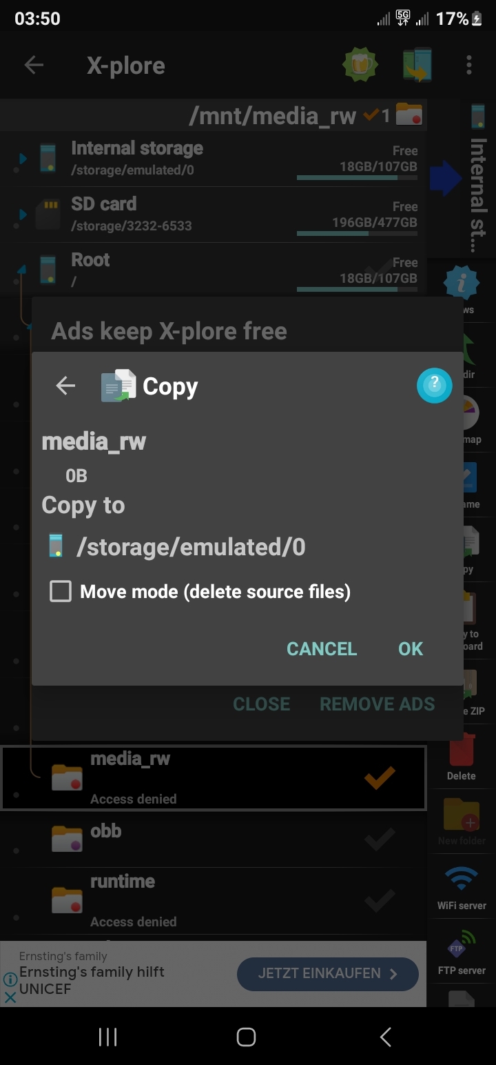
I have like eight different file-browsers on my phone, as each has one or more features the others won’t, or can’t impliment. ES File whatever - the only one that can set a file as a ring-tone. X-plore File-Manager - let’s me sort media files based on length, not just age, name or file-size … and also happens to be the only mobile file-browser I’ve seen with the feature requested in the OP.
For my day-to-day, I use fx File Browser, and I couldn’t even tell you why. I’m of an age where I stick to what I’m used to until I’m forced into an alternative, and even then that one feature usually doesn’t make for a new daily driver. “Dev’s” like are crowding this thread are doing their best to make sure it stays that way. I’m ready to jump ship to a Linux phone because there are fewer (shit)devs writing apps for them.
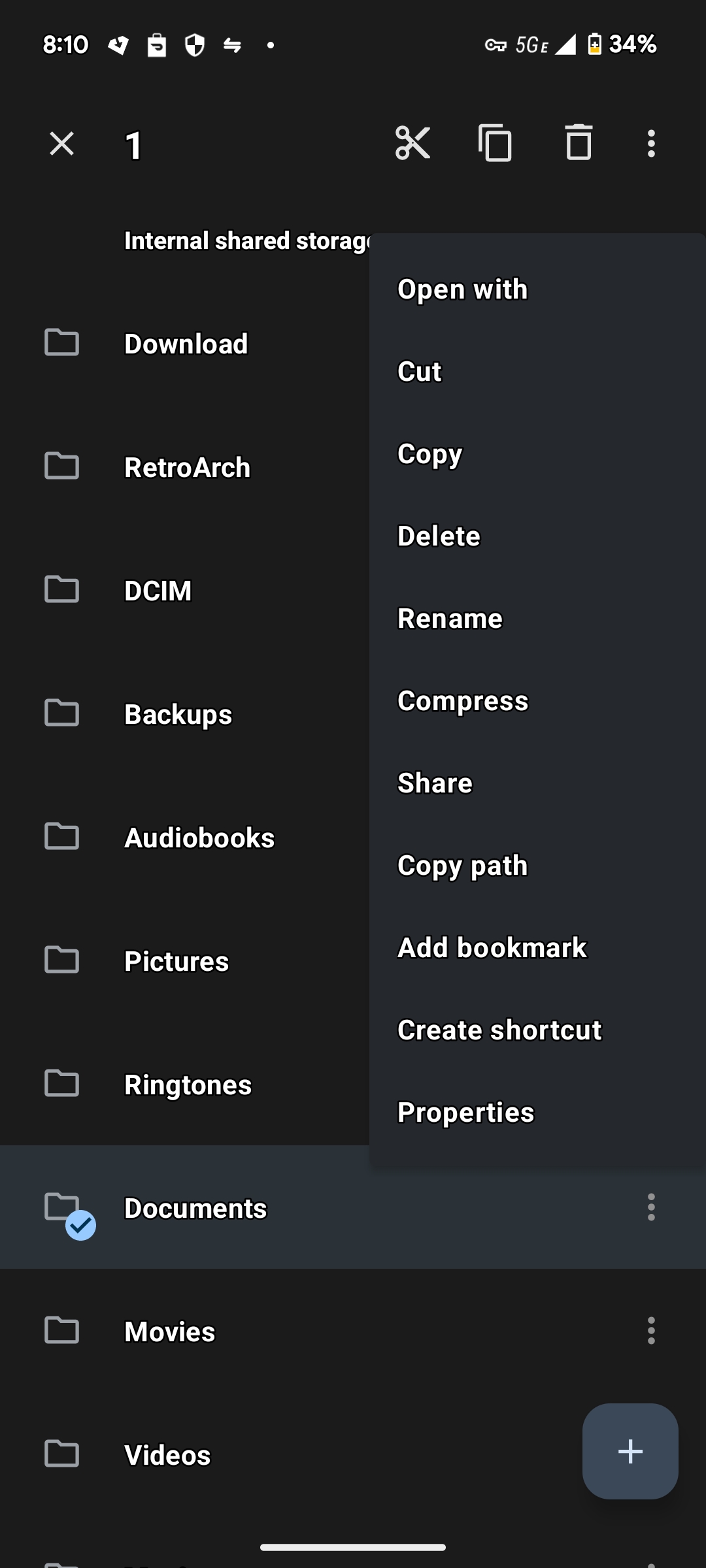
I use the app it is for android but it already has that feature: https://paste.tchncs.de/upload/bear-wolf-eagle
First off, your link doesn’t work. Do you know how to use Lemmy?

Second, no, Material Files does not have the “Move To” or “Copy To” features OP requested, although I’ll agree, its a weird feature request for an android app:


Still, it IS a feature in the android app X-Plore File Manager:

Please, in the future, bother to try to understand even the very basics of that on which you speak. okthxbai
It does have those abilities. Does op just want to rename them?


You can copy as many as youd like too. What more do they want?

Yeah, most file managers don’t have “copy to” feature. But, some file managers allow opening multiple panes so copy-paste operation is not as painful when you need to collect a lot of files from different locations in your phone.
Material Files actually does allow for multiple windows on Android
No one cares. It does NOT have the feature requested in the OP:


X-plore File Manager does:


