Warning: Some posts on this platform may contain adult material intended for mature audiences only. Viewer discretion is advised. By clicking ‘Continue’, you confirm that you are 18 years or older and consent to viewing explicit content.
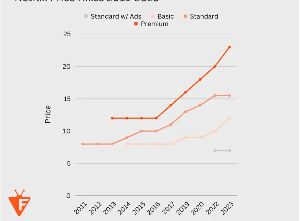
Nothing happened. There was no price increase those years. The chart isn’t misleading at all, OP just cut off the title, “Netflix Price Hikes 2011-2023.” 2018 and 2021 aren’t relevant because there was no change.
Then why are 2012 and 2016 included? It’s extremely confusing to have a line graph over time where intervals of time are missing, even if you clearly call attention to it, which they don’t here.
There are other “nothing happened” data points. A graph represented as having a x-axis of time shouldn’t be staggered anyhow.
This is definitely misleading. It’s a time series chart with arbitrary data points just casually missing.