From the other place: https://www.reddit.com/r/space/comments/1dmibwd/this_is_my_most_advance_moon_photograph_ever_it/
Pics too good to miss. :)

From the other place: https://www.reddit.com/r/space/comments/1dmibwd/this_is_my_most_advance_moon_photograph_ever_it/
Pics too good to miss. :)
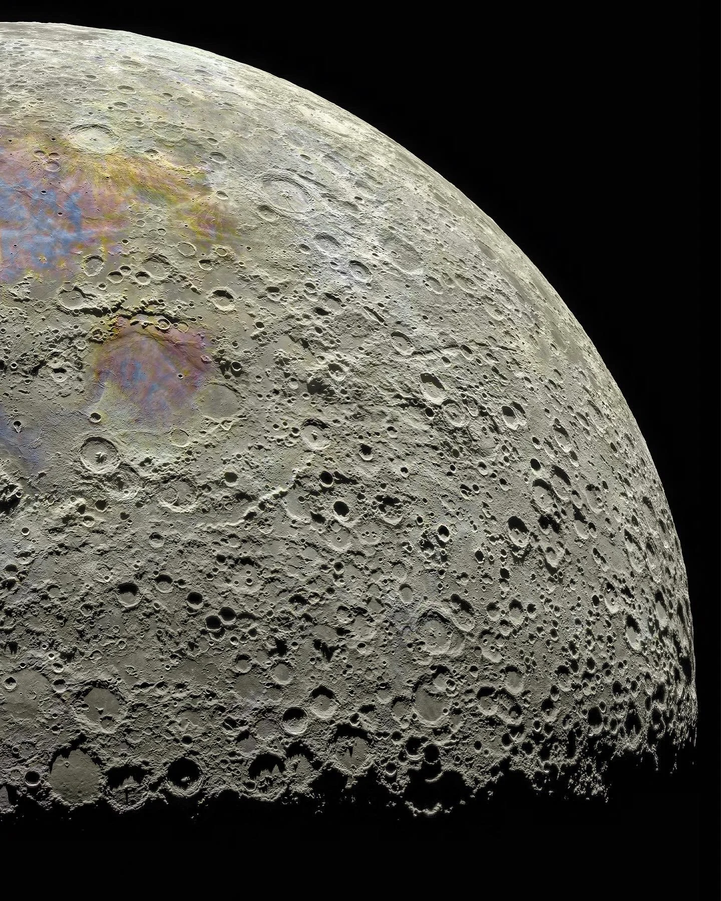
Knowing what I know, I am assuming this image was standardised and then normalised (fancy stats algos to keep things in the same visual range) while stitching it together, and the final product enhanced a lot of colouration (saturation). They’re subtle or undetectable to the naked eye, but they exist. They are reflected in the different minerals present. I’ve done this stuff (raster stitching) with different imagery. Op was active in the comments with info, but I didn’t read up on it.
Pasted from the Reddit thread:
Those are great explanations!
Yeah when you get into “proper” photography you quickly realize a “real” image is somewhat subjective. This moon is cracked to 1000%, though.
It’s true. I did photography as a hobby as a kid and it set me ahead when I started mapping. It’s all the same no matter the domain.
here’s what I’d like to know: would we perceive any of this pigmentation from the lunar surface?
Excellent explanation. Appreciate you sharing it!