Warning: Some posts on this platform may contain adult material intended for mature audiences only. Viewer discretion is advised. By clicking ‘Continue’, you confirm that you are 18 years or older and consent to viewing explicit content.
Oh, yeah, I meant that it makes two characters into one big one, visually reaching across two or three widths, or just having one of the characters larger than the usual grid, e.g. in := the equals sign reaches into the width of the colon.
This reminds me of a recent Microsoft font¹, so naturally here’s a rant about that: They developed a feature, called “texture-healing”, which basically allows characters that normally need to cramp into one monospace width, like m or w, to reach into the space of neighboring characters, if those neighboring characters are narrow, like an i.
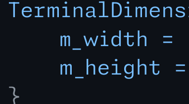
In theory, not a terrible idea, but then you get this kind of hate crime:
Obviously, might just be me again, but not having these letters align, just looks so much worse to me.
Oh, yeah, I meant that it makes two characters into one big one, visually reaching across two or three widths, or just having one of the characters larger than the usual grid, e.g. in
:=the equals sign reaches into the width of the colon.This reminds me of a recent Microsoft font¹, so naturally here’s a rant about that: They developed a feature, called “texture-healing”, which basically allows characters that normally need to cramp into one monospace width, like
morw, to reach into the space of neighboring characters, if those neighboring characters are narrow, like ani.In theory, not a terrible idea, but then you get this kind of hate crime:
Obviously, might just be me again, but not having these letters align, just looks so much worse to me.
¹: It’s this font: https://monaspace.githubnext.com/