Warning: Some posts on this platform may contain adult material intended for mature audiences only. Viewer discretion is advised. By clicking ‘Continue’, you confirm that you are 18 years or older and consent to viewing explicit content.
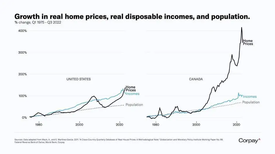
I hate it when the chart doesn’t say what it depicts. I assume those are averages, not median. The average hides that fact that most people’s real income has barely grown in 20 years. All the income growth comes from the top 20% or so, you don’t see that in the average.
I hate it when the chart doesn’t say what it depicts. I assume those are averages, not median. The average hides that fact that most people’s real income has barely grown in 20 years. All the income growth comes from the top 20% or so, you don’t see that in the average.