Warning: Some posts on this platform may contain adult material intended for mature audiences only. Viewer discretion is advised. By clicking ‘Continue’, you confirm that you are 18 years or older and consent to viewing explicit content.
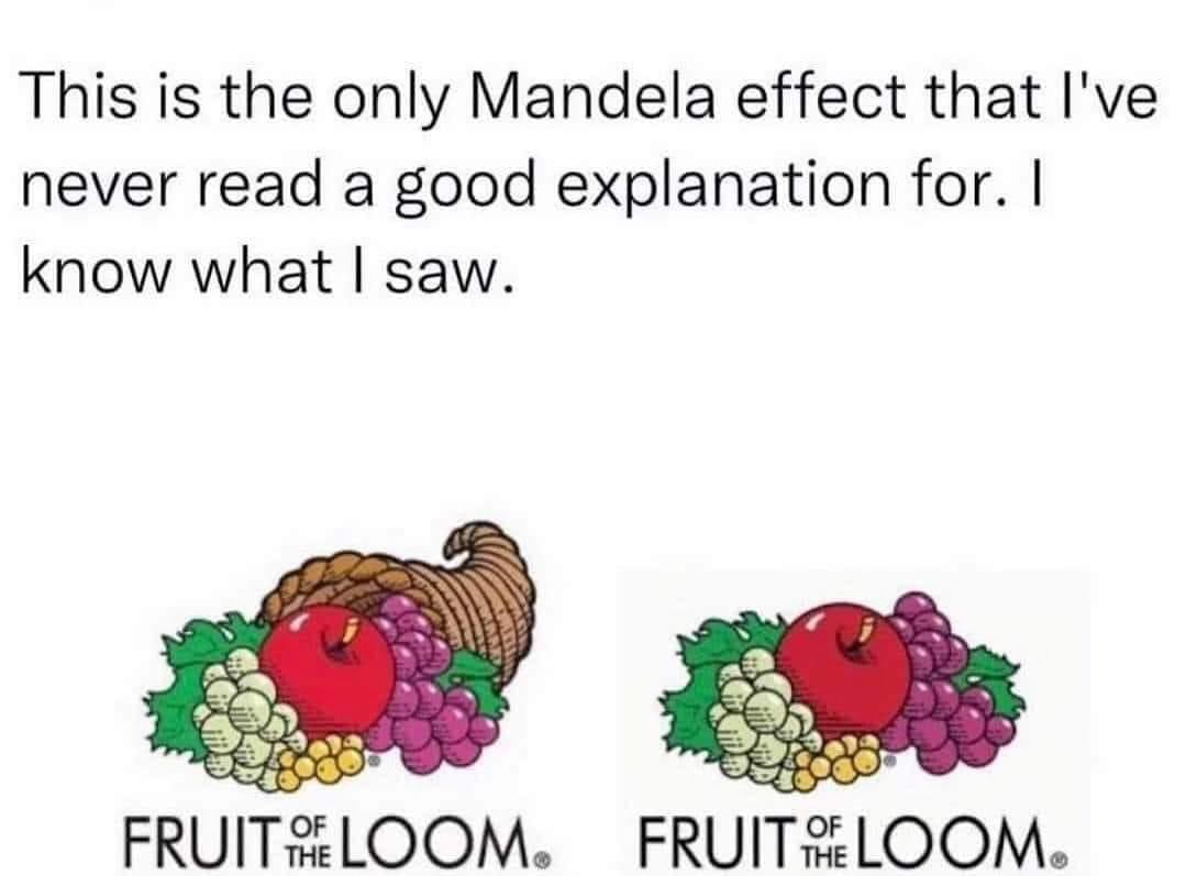
I’m not aware of what fruit of the loom is but tbh i think they should add it, the logo just doesn’t look right without it (it’s color palette improves the logo and makes it more square-ish)
I’m not aware of what fruit of the loom is but tbh i think they should add it, the logo just doesn’t look right without it (it’s color palette improves the logo and makes it more square-ish)
deleted by creator
It’s not wrong though.
Underwear brand and that would be hilarious.
Clothing brand. Not just underwear.