Warning: Some posts on this platform may contain adult material intended for mature audiences only. Viewer discretion is advised. By clicking ‘Continue’, you confirm that you are 18 years or older and consent to viewing explicit content.
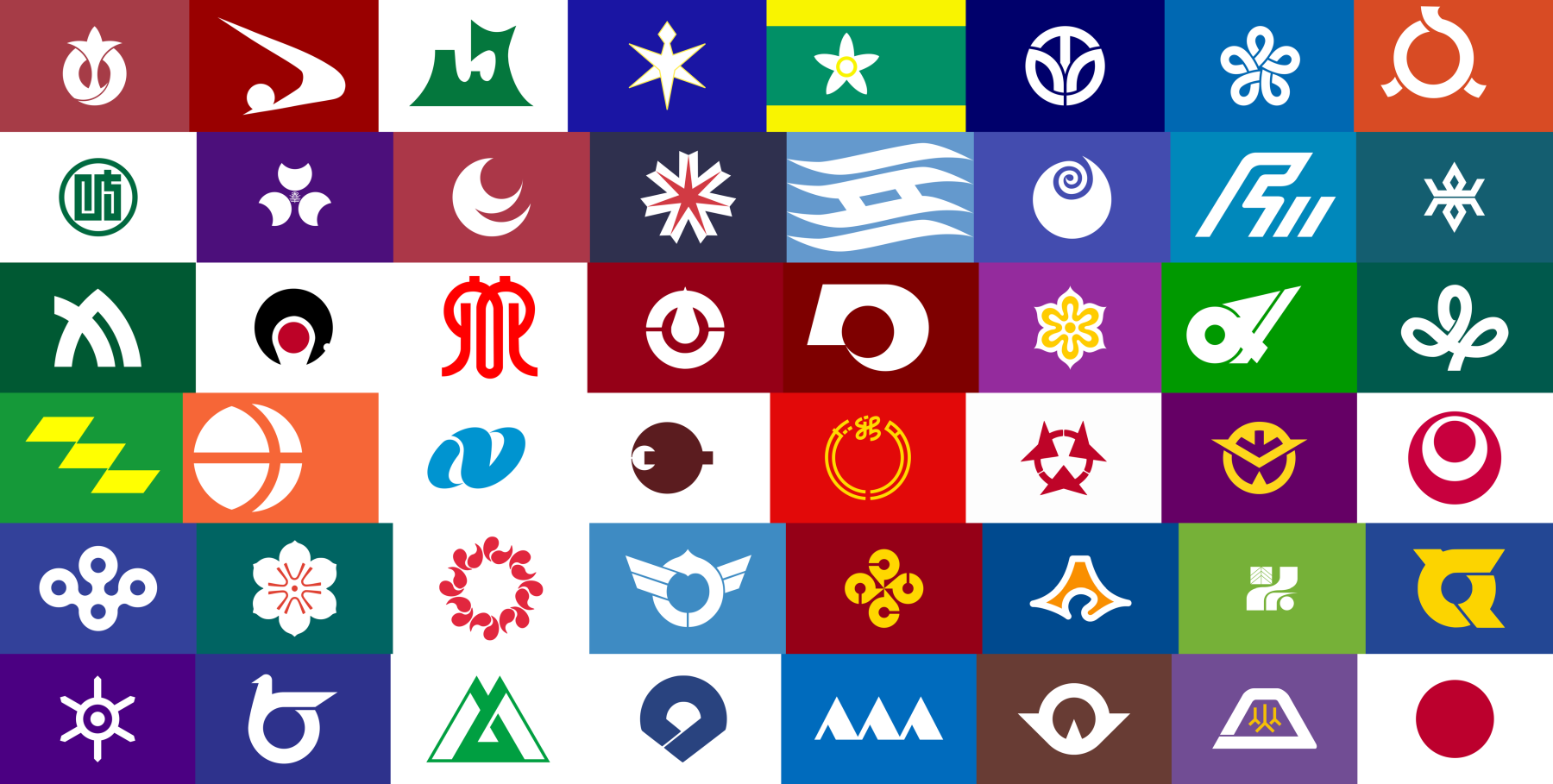
Far right column, fourth one down from the top. I like that it’s a visual pun on the Japanese flag; the little red dot on a white field inside the larger dot effectively depicts a little Japan inside the larger nation, a microcosm of the nation itself.
It’s a very effective vexillological distinction of a part within a whole, while still maintaining the effect of the original flag design.
I also find it funny that it seems to be a flex on all the other prefectures, this flag subtextually implies, “We’re the most Japanese prefecture that has ever been, we are the essential core of this nation and our absence would leave a blank empty void. Don’t fuck with us.”