The comment itself is still fully visible, which is especially annoying for longer comments. This changed after the update.
I’ve looked for an option to disable but haven’t found it. If it’s not an option, it would be good to add that option, otherwise I might just not see it?
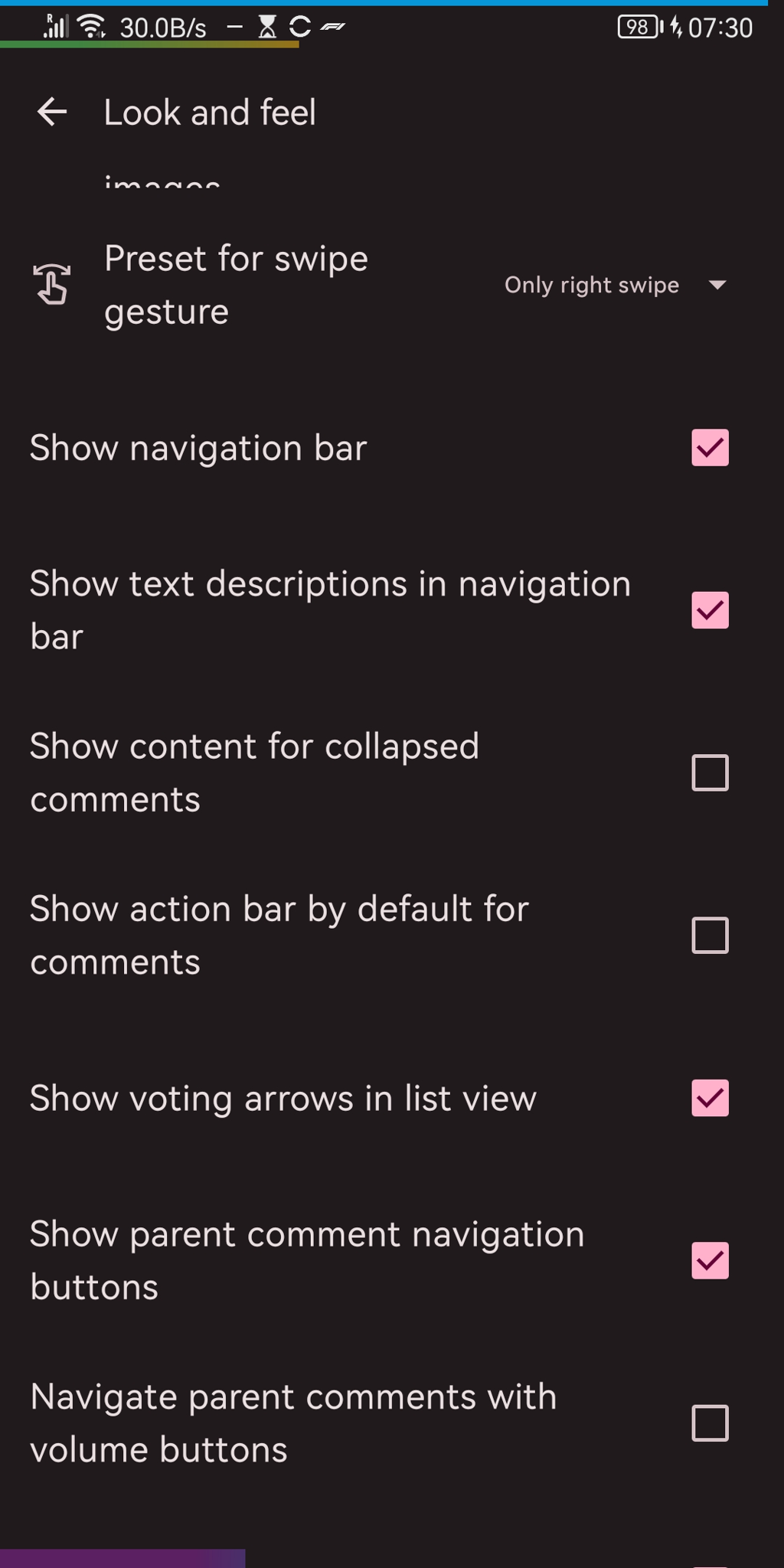
Solution: An option for this exists. See comments if you can’t find it.
Disable this: Settings -> Look and feel -> Show content for collapsed comments

Ah thanks that’s exactly what I was looking for.
That’s funny because I like the new behavior better. So it’s good to have an option it seems.
Always good to have options
In 61 a migration is borked, this caused some appsettings to be switched around. So it enabled the setting
Show content for collapsed commentsand disabled another one.Now I fixed this, so this means those who changed them will see them swap again. And those who haven’t upgrade yet won’t notice anything. There should be release tomorrow which address all the bugs introduced in this update. Sorry for the inconvenience!
Everything alright. You’re doing an amazing job and Jerboa is a awesome application.
Demo comment.
When you collapse this comment (by single tapping into the body), it won’t collapse into only a “header”. Instead, only child comments will disappear.
Demo comment
Yeah, I have the behavior you’re describing occur on some other clients for some other things and it drives me nuts since I prefer the original Jerboa way (and always have)