Warning: Some posts on this platform may contain adult material intended for mature audiences only. Viewer discretion is advised. By clicking ‘Continue’, you confirm that you are 18 years or older and consent to viewing explicit content.
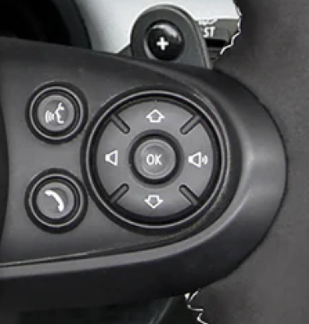
The designer of this layout look at the display, saw that the volume slider was going left/right and placed the buttons accordingly (probably what happened).
That is what I imagined as well. Some QA or tester or whatnot probably found it annoying to click left/right when navigating the radio. It does make some sense.
The designer of this layout look at the display, saw that the volume slider was going left/right and placed the buttons accordingly (probably what happened).
This and radio channels/tracks are presented in a list on modern displays. “Down” is the next item.
That is what I imagined as well. Some QA or tester or whatnot probably found it annoying to click left/right when navigating the radio. It does make some sense.