Warning: Some posts on this platform may contain adult material intended for mature audiences only. Viewer discretion is advised. By clicking ‘Continue’, you confirm that you are 18 years or older and consent to viewing explicit content.
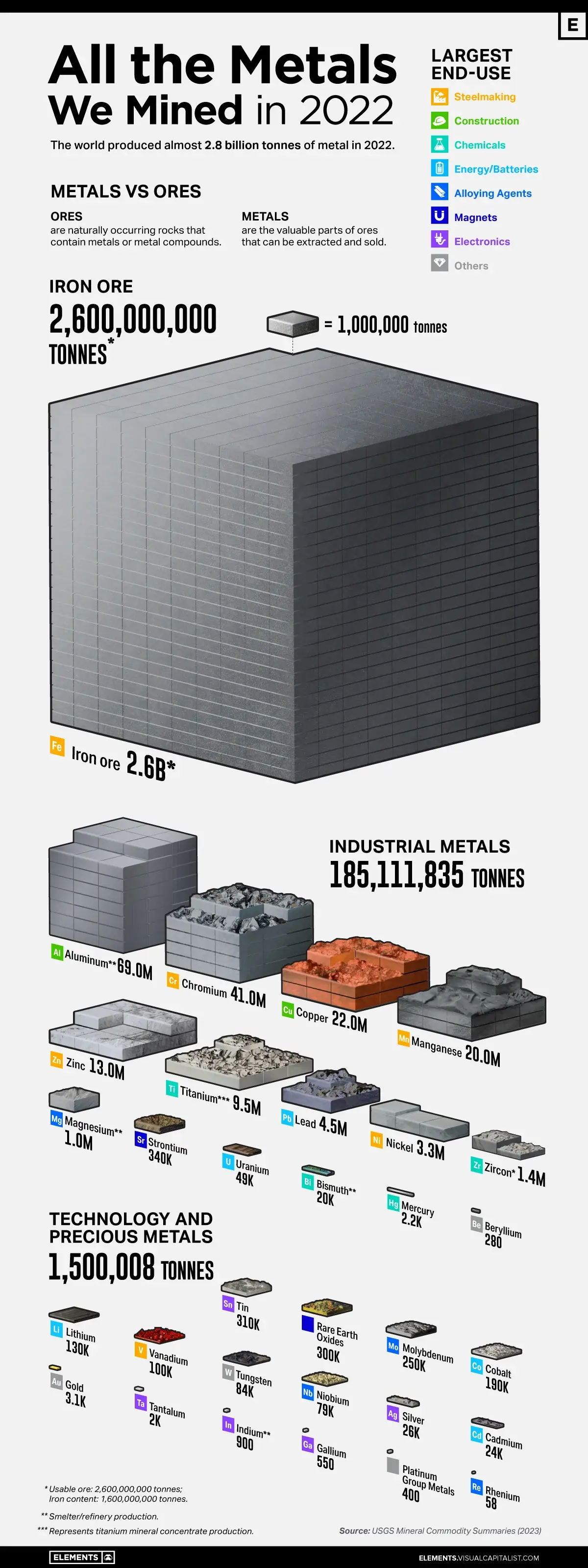
I wish charts like this included how much damage environmentally each of those did, proportional to the amount mined; as well as comparisons with previous years and estimates for how much is left.
“Environmental damage” isn’t something that’s reducible to a single number on a graph. There’s no way to convert cancer incidents into carbon emissions or increased soil nutrient mobility, etc.
And reserves aren’t necessarily a fixed number. What exists underground isn’t the same as what’s economically recoverable. And as the price of a mineral goes up, it may become more economically recoverable and worthwhile to dig up more.