Warning: Some posts on this platform may contain adult material intended for mature audiences only. Viewer discretion is advised. By clicking ‘Continue’, you confirm that you are 18 years or older and consent to viewing explicit content.
I think it would help to use to same grid for the squares for all teams. You’d need a grid of 5 by 14, leave the not performed squares black. In that way a higher colored stack means more quick pitstops, a higher stack of grey squares means a higher amount of performed stops overall.
![[@code____F1] Pitstops less than 2.5 seconds for the top 4 constructors](https://lemmy.world/pictrs/image/fc9a96b9-cdb8-4aa4-9804-8a92983c257f.jpeg)
It’s mildly annoying that they didn’t use the same number of pitstops for all four
I assume they have done different amounts though, so how would you split it? I assume that the conditions at different races would effect the times.
Couldn’t help myself and quickly created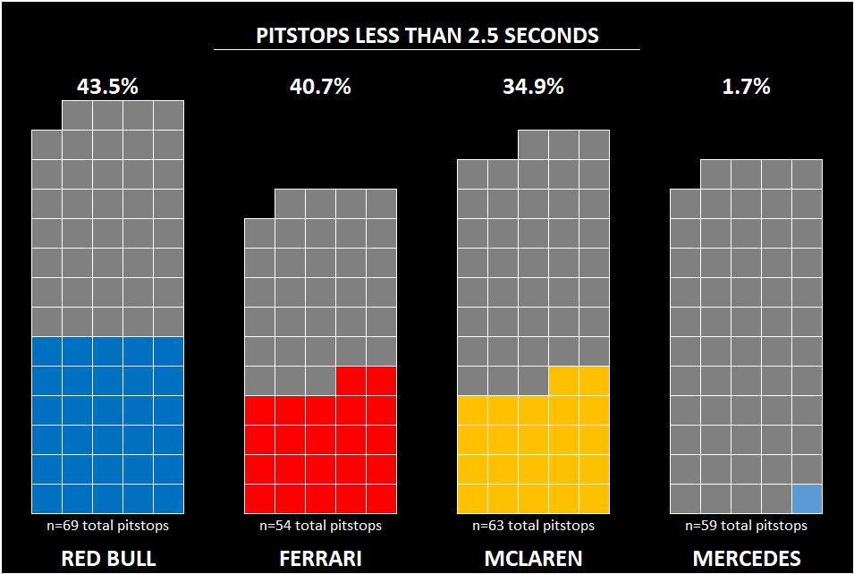 in excel. It’s not as fancy, but feel like it gives a better idea
Looks so much better!
I think it would help to use to same grid for the squares for all teams. You’d need a grid of 5 by 14, leave the not performed squares black. In that way a higher colored stack means more quick pitstops, a higher stack of grey squares means a higher amount of performed stops overall.
I’d just take the last 50