Warning: Some posts on this platform may contain adult material intended for mature audiences only. Viewer discretion is advised. By clicking ‘Continue’, you confirm that you are 18 years or older and consent to viewing explicit content.
A new version of ONLYOFFICE, an open-source productivity suite for Windows, macOS, and Linux, is available to download. ONLYOFFICE 7.5 includes the usual
I’ve been using LibreOffice as an MS Office replacement for a decade or so, although most of my documents are still on Google docs. The LibreOffice UI seems to have never really improved at all, and even the updating experience is annoying. I don’t understand how such a lucrative productivity app has no developer support behind it?
OpenOffice got me really excited, because that UI seems modern and polished. It’s really unfortunate that it’s mostly we lb based and apparently really slow.
So yeah, 100% agree with you. LibreOffice with the OpenOffice UI would be 🔥
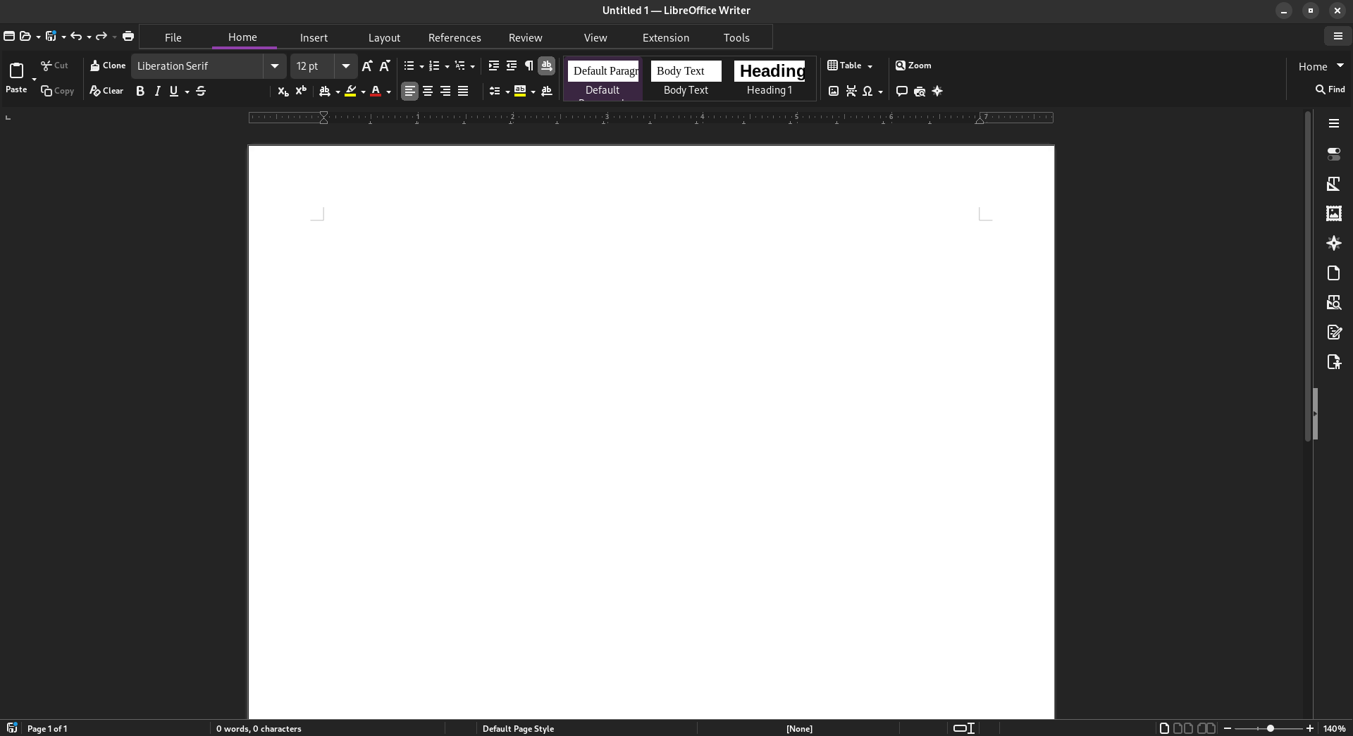
It’s not a default but I just changed it to tabbed view in the settings, picked Sifr icons in the settings, and installed adw-gtk3 theme on GNOME which makes gtk3 apps blend more with the default libadwaita GNOME theme.
I’ve been using LibreOffice as an MS Office replacement for a decade or so, although most of my documents are still on Google docs. The LibreOffice UI seems to have never really improved at all, and even the updating experience is annoying. I don’t understand how such a lucrative productivity app has no developer support behind it?
OpenOffice got me really excited, because that UI seems modern and polished. It’s really unfortunate that it’s mostly we lb based and apparently really slow.
So yeah, 100% agree with you. LibreOffice with the OpenOffice UI would be 🔥
I assume you mean OnlyOffice
Oops, yeah, I did!
Btw, There’s about 4 UI’s with two variants each in view > user interface.
I did not know that, I’ll check out the other options, thanks!
Idk, LibreOffice UI seems pretty decent for me.
It’s this the new UI? It’s been a while since I use LibreOffice and the UI was worse than office 2003.
It’s not a default but I just changed it to tabbed view in the settings, picked Sifr icons in the settings, and installed adw-gtk3 theme on GNOME which makes gtk3 apps blend more with the default libadwaita GNOME theme.
It’s actually not bad! Thanks!
Before
After
Neat, the customization does help make it look a lot better than the defaults. I wonder why they didn’t just make this the new UI.
Actually my dad prefer the default UI. But he used Windows 95 and the office suite that goes with it for a long time, so his habits are hard to loose.
I’m impressed by how they were able to make a worse ribbon interface than Microsoft itself.