Warning: Some posts on this platform may contain adult material intended for mature audiences only. Viewer discretion is advised. By clicking ‘Continue’, you confirm that you are 18 years or older and consent to viewing explicit content.
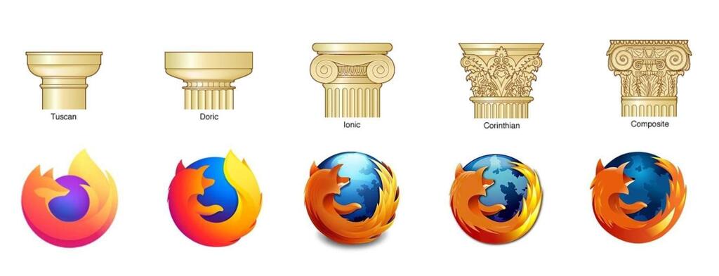
I know I’m completely butchering the color palette here, but I’ve finally realized what I felt was missing from the new logo. In the previous iterations, the head was always turned in such a way that you couldn’t see the eyes. Now the head is at an angle where you should see the right eye. But you don’t, the head is completely empty.
Here’s an “”““improvement””“” making the logo a bit more friendly I think:
Now it looks like it has a mole lol