Warning: Some posts on this platform may contain adult material intended for mature audiences only. Viewer discretion is advised. By clicking ‘Continue’, you confirm that you are 18 years or older and consent to viewing explicit content.
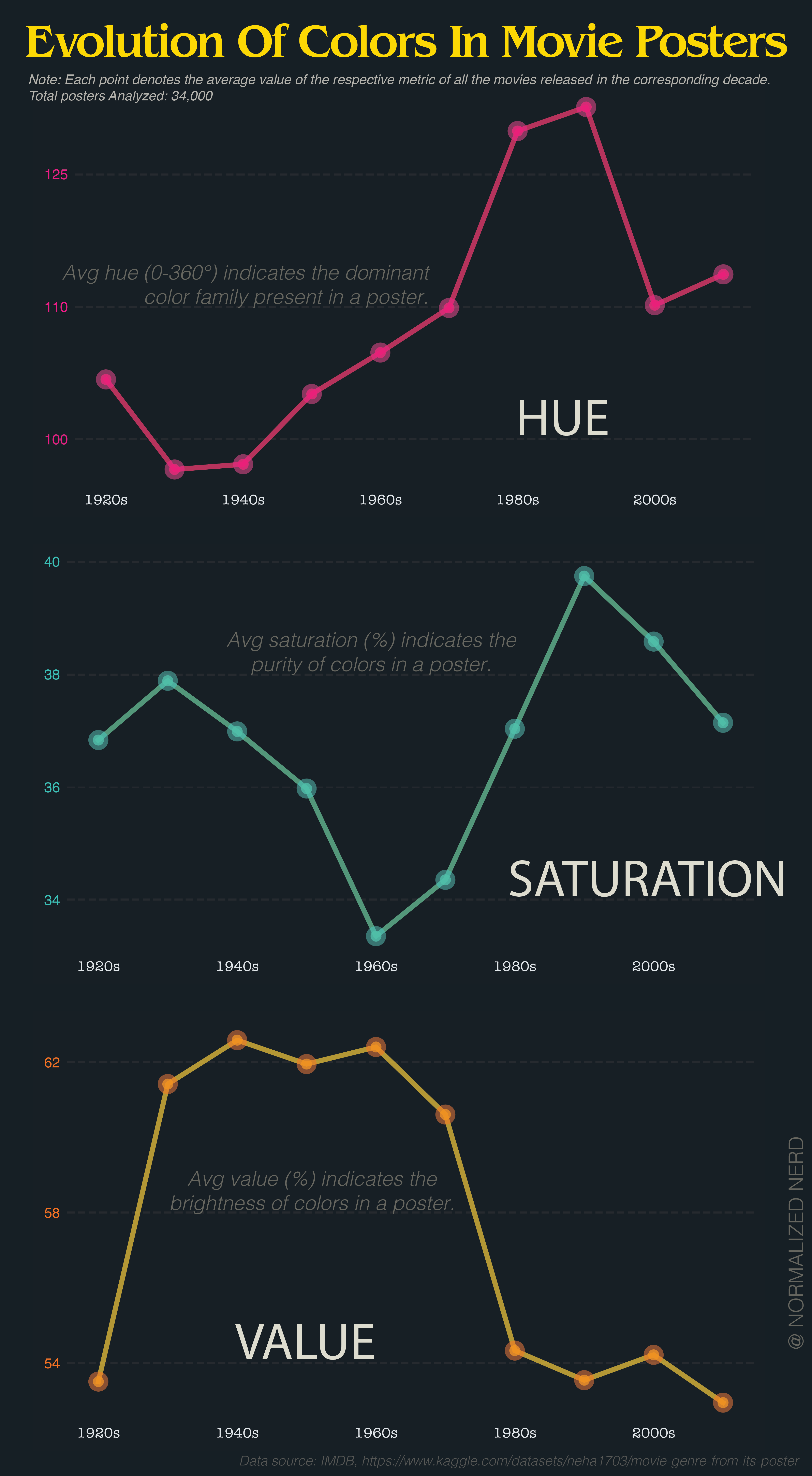
yeah that part of the graph is completely useless to people who haven’t memorised the exact degrees of the scale, which is most people, even most artists
I’d be nice to have a color legend next to the y-axis of hue
yeah that part of the graph is completely useless to people who haven’t memorised the exact degrees of the scale, which is most people, even most artists
That’d be nice.
90 and 120 are rolling through the greens. Are posters mostly green? That seems odd to me.
The problem is that averaging hue makes no sense at all because hue is not a longest scale.
If you take a red poster (0) and a blue poster (240), it averages to green. Or take red (0) and red (359), averaging to cyan (180).
The average of 0° and 359° is obviously 359.5°.
it’s a radial scale.
By that logic, the average of red and cyan is both purple and lime. Still useless.
Not if there is a clear trend. If most movie posters are blue, three average will be blue.
But i agree, it is useless if there is no clear trend.
Or even better, change the color of the points and lines to match the associated hue.