Warning: Some posts on this platform may contain adult material intended for mature audiences only. Viewer discretion is advised. By clicking ‘Continue’, you confirm that you are 18 years or older and consent to viewing explicit content.
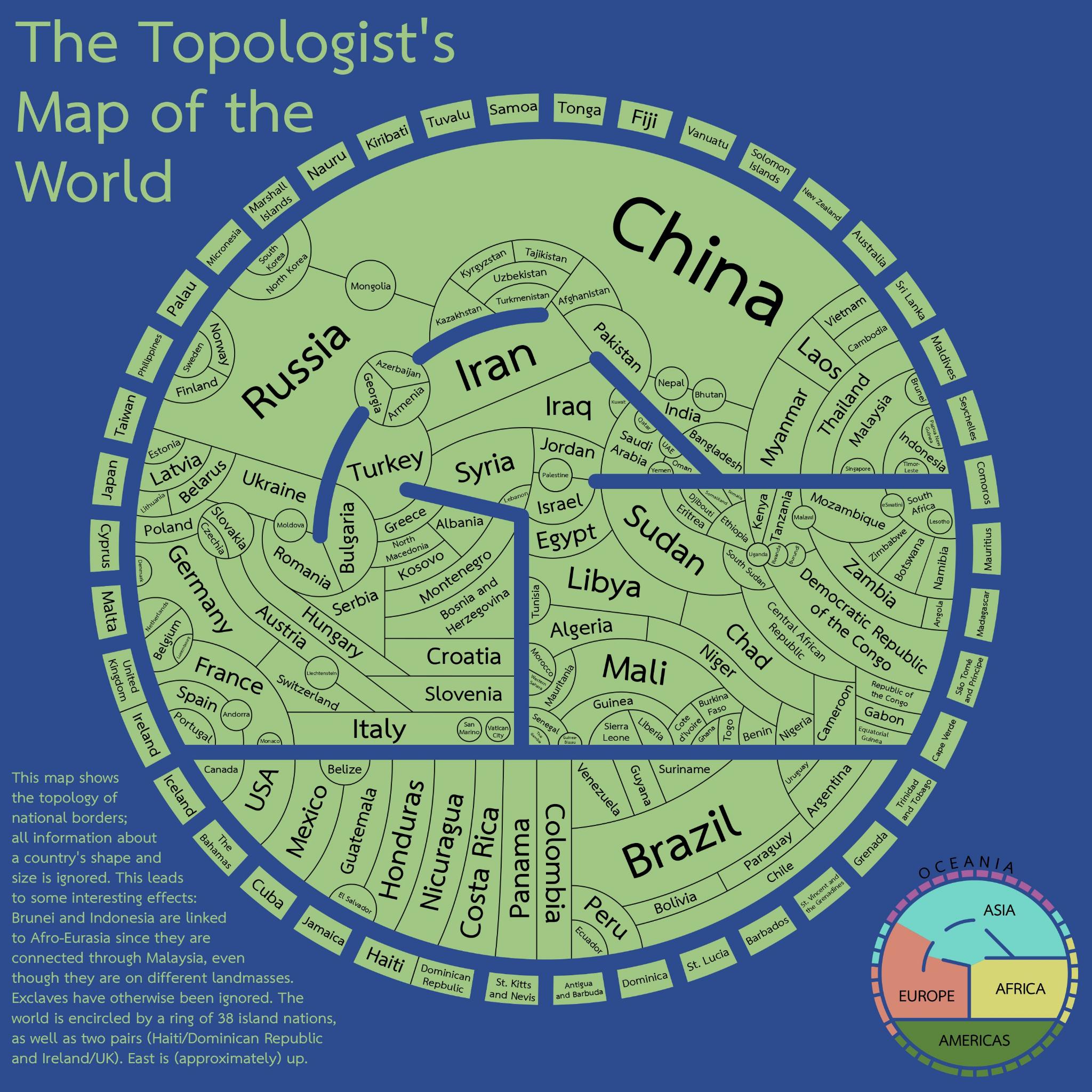
There are several seas here: Red, Mediterranean, Black and Caspian. The Arctic and Antarctic Oceans are not represented, that’ll minimize the perimeters of Canada and Russia.
Overall, this is a very intriguing visualization of the political world. Fascinating stuff. Which I’m not sure I fully understand, don’t get what “topology” refers to, but to me it evokes an image highlighting different altitudes, as with mountains, valleys and coastlines.
If altitude is portrayed I don’t see it. I think this map is purely to show borders/adjacency without consideration of size and only vague consideration of location. Size kinda sorta correlates with the number of adjacent countries but also seems a bit arbitrary.