Warning: Some posts on this platform may contain adult material intended for mature audiences only. Viewer discretion is advised. By clicking ‘Continue’, you confirm that you are 18 years or older and consent to viewing explicit content.
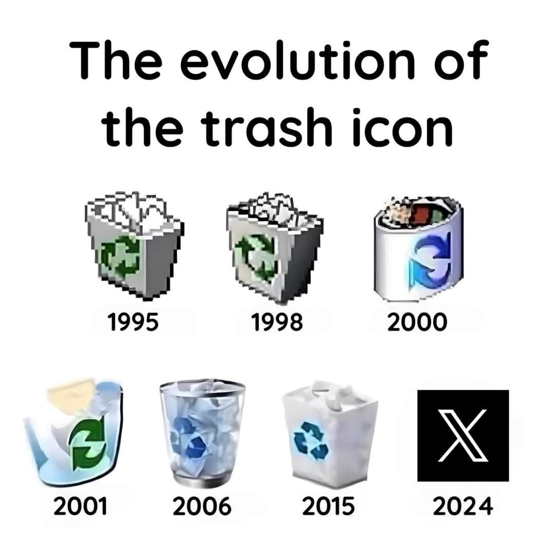
Frutiger Aero my beloved. The apotheosis of skeuomorphic design, killed by a neverending downward spiral towards the least distinctive, creative, and inspired designs imaginable.
It’s really ironic that this design cycle coincided with the rise of high-DPI displays. All those pixels used to upscale monochrome boxes with square corners. What a tragedy.
I miss Aero
I miss it too. All this minimalist design and no soul.
https://old.reddit.com/r/Skeuomorphism/comments/xy32cz/some_skeuomorphic_icons_and_themes_for_linux/