Warning: Some posts on this platform may contain adult material intended for mature audiences only. Viewer discretion is advised. By clicking ‘Continue’, you confirm that you are 18 years or older and consent to viewing explicit content.
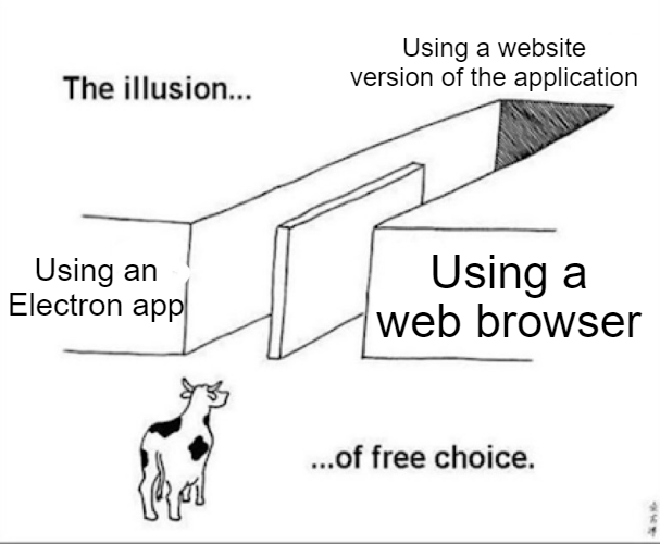
No electron app ever looks good anywhere. They are consistent insofar that they look shit on all OS, equally. And alias their fonts wrong. And scale them wrong. And break accessibility.
Sure, there’s always a bar to clear. And yet Electron can’t even properly alias fonts if the creator doesn’t do it properly, as it tries to use Chrome’s broken font rendering by default. Nevermind scaling the size of anything, which just becomes a blurry mess if the app wasn’t created well enough (see the mess that is Signal as an example).
Uh huh. Electron apps look good on Windows. Sure.
No electron app ever looks good anywhere. They are consistent insofar that they look shit on all OS, equally. And alias their fonts wrong. And scale them wrong. And break accessibility.
They don’t break accessibility. Electron fares better in accessibility than some native app frameworks.
Sure, there’s always a bar to clear. And yet Electron can’t even properly alias fonts if the creator doesn’t do it properly, as it tries to use Chrome’s broken font rendering by default. Nevermind scaling the size of anything, which just becomes a blurry mess if the app wasn’t created well enough (see the mess that is Signal as an example).