Warning: Some posts on this platform may contain adult material intended for mature audiences only. Viewer discretion is advised. By clicking ‘Continue’, you confirm that you are 18 years or older and consent to viewing explicit content.
I actually prefer the newer ones, i always hated the like shiny 3d type of look. However some companies/designers/whatever do a bit to much nowadays. or should i say to little🤔
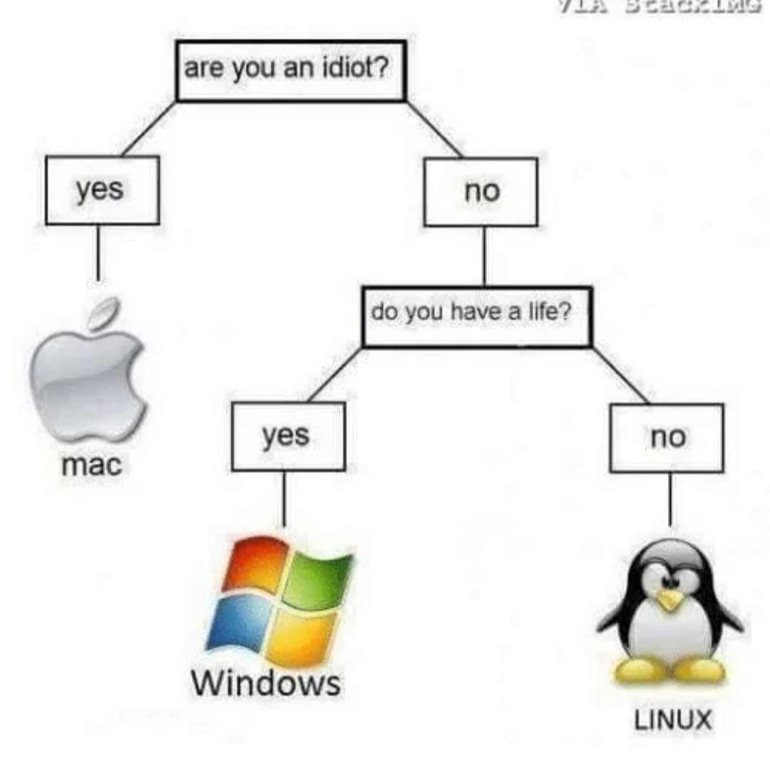
This meme has the logos of the OSs from around 2007. Back then there weren’t many Linux non-IT users.
I miss those old logos, the new ultra flat ultra simple logos are just so uninteresting compared to that era
I actually prefer the newer ones, i always hated the like shiny 3d type of look. However some companies/designers/whatever do a bit to much nowadays.
or should i say to little🤔Ah. True. Thanks. Yes dark times with hardware compatibility back then.