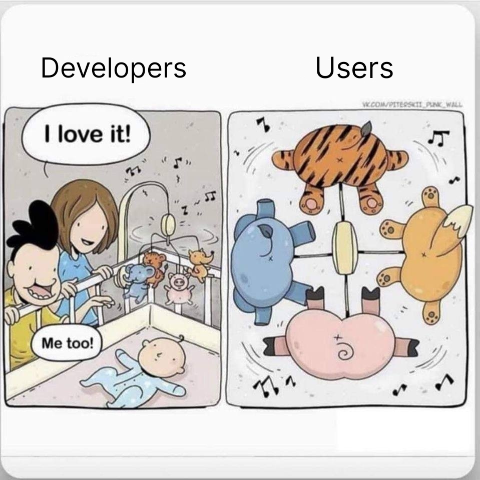
(I can’t find the artist’s webpage to link to, just some credits saying that this might be a translated Russian comic posted by Piterskii Punk)
That is actually a really good point.
https://www.amazon.com/s?k=baby+mobile
Almost none of these mobiles, in a quick skim, have the interesting stuff on the mobile ornaments aimed at the kid. They’re instead aimed at the adult.
Exactly this. I work with parents of very young children, and I always tell them that if they’re buying something like a mobile or art for the walls, they need to lie on the ground and look up at it from a baby’s perspective to know what it’ll really look like.
Same reason that wall decor for babies and toddlers needs to be less than 3 feet from the floor. Otherwise it’s just for the parents’ benefit.
I imagine it’s similar to dog toys. Ultimately I don’t think my dog cares if her toys look like frogs or squirrels or ducks, but I do.
My cat absolutely cares if something is shaped as a mouse, or a ball. He goes crazy for balls and mice. Throw a cube and he doesn’t give a shit
It’s not like the baby really cares. Moving colourful stuff that makes a sound, what more could you want?
Babies do start to pick up on faces early on – we’ve got some hardwired stuff there – and on the mobiles there, the faces are away from the baby.
https://www.whattoexpect.com/toddler/self-recognition/
-
At birth: Even though your baby doesn’t recognize you, she certainly likes the look of you. Studies have shown that even newborns, with their eyesight limited to about 12 inches, prefer to look at familiar faces — especially yours.
-
Months 2 to 4: Your baby will start to recognize her primary caregivers’ faces, and by the 4-month mark, she’ll recognize familiar faces and objects from a distance.
Most of the complex details and shapes are facing away. Oddly, of the mobiles I see there, the few designs aimed at the baby are mostly black-and-white, not colorful, while I’d have also thought that color would be preferable.
When they’re really little, high contrast is more clear and theoretically more interesting. There’s a lot of black and white toys aimed at newborns for that reason.
-
Wow, this is bad. I feel like this was not the case in early 2010s, but maybe my memory is bad. My favorite was always the baby Einstein fish TV on the crib wall. It encouraged fun tummy time stuff, and had cool lights and music.
Stuff is done to sell, hence it targets those who make the purchases not the end-users.
You see that a lot in things like children toys, often resulting in the funny result that the kid that gets the toy as a gift ends up having more fun from the box the toy came in than from the toy itself.
Explains my urge to eat my wife’s ass
Also explains my urge to eat this man’s wife’s ass.
Hey get in line buddy
My wife will be so excited to see this post, she might even use the bidet
There’s shorter queue here for his mom
She dead, so very short line. Also cremated, so it’s quick!
Yeah, but I don’t want to miss out on this human centipede forming
Try not to eat any ass on your way through the parking lot!
In a row?!?
Ass men aren’t born; they’re made.

I was gonna say, clients aren’t the only ones.
Feels like a lot of developers and especially UX designers have a bad habit of disappearing up their own asshole nowadays.
It’s a reason why sometimes an open source project manages to be way better than a comparatively well resourced commercial offering. When the developers are the users, they will get the nuance of things.
Works well for a lot of “power user” software where the users are either developers, or at least similar mindset as a developer. Sometimes open source doesn’t deal too well with making things simple without power user features that casual users may find confusing or distracting.
In my experience developing In-House custom software it’s more “Managers” and “End-users”: basically the requirements for the software that’s developed are defined by the manager overseeing an area and hence based on their point of view of the business process they oversee, which is often not at all the same point of view as the people working in that process.
I’ve seen again and again software being made exactly to the spec provided by team/area management and then turning out to have lots of problems for the actual users to use.
In my experience the best results come from having the developers talk directly with the end-users, even if the language the devs tend to speak and their preconceptions at first don’t match those of the end-users.
They’ll be satisfied with spinning pregnancy test sticks and packets of ketchup.
ketchep
What the fuck
I don’t know how that happened
Piterskii Punk (Russian: Питерский панк) posts drawings in VK social network. Of course, in Russian
https://vk.com/piterskii_punk_wall
That’s in response to OP’s text
P.S. Oh, wait, it’s in the comic, lol. Looks like we both are not quite attentive :D
😂

Hey! I had the same mobile as a baby. 😃
(Isn’t the artist’s website up in the top right corner of the comic?)
I was reading that as a W instead of VK, but someone linked to it elsewhere in the comment section.
The software isn’t made for the user, because the user isn’t the one paying for it.
Old but gold.