Warning: Some posts on this platform may contain adult material intended for mature audiences only. Viewer discretion is advised. By clicking ‘Continue’, you confirm that you are 18 years or older and consent to viewing explicit content.
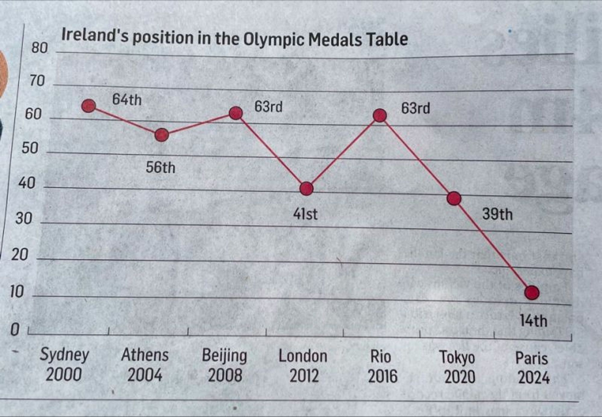
This reminds me of that chart showing gun deaths over a few years that showed the line going down the more deaths there were. That made sense graphically, they colored it in to look like blood dripping down, but this is just dumb.
This reminds me of that chart showing gun deaths over a few years that showed the line going down the more deaths there were. That made sense graphically, they colored it in to look like blood dripping down, but this is just dumb.